In this section, the excel setup from X Bar method for Gage R&R. For the equation setup and calculation limits, please refer to the Gage R&R Link for equation and constant setup.
Before initiating the Excel setup, the Excel file generated will be broken down into three sections. The Setup Section, Data Section and Graph Section for this particular gage R&R setup.
*Remark: All constant or calculated values are stored in single cell or pre-named under name manager, so the actual formula will be depending on which cell the required elements are stored or named.
Before collecting the gage R&R calculation and graph execution, The setup page will have critical input and essential parameters to perform gage R&R calculation for the index along with variation chart.
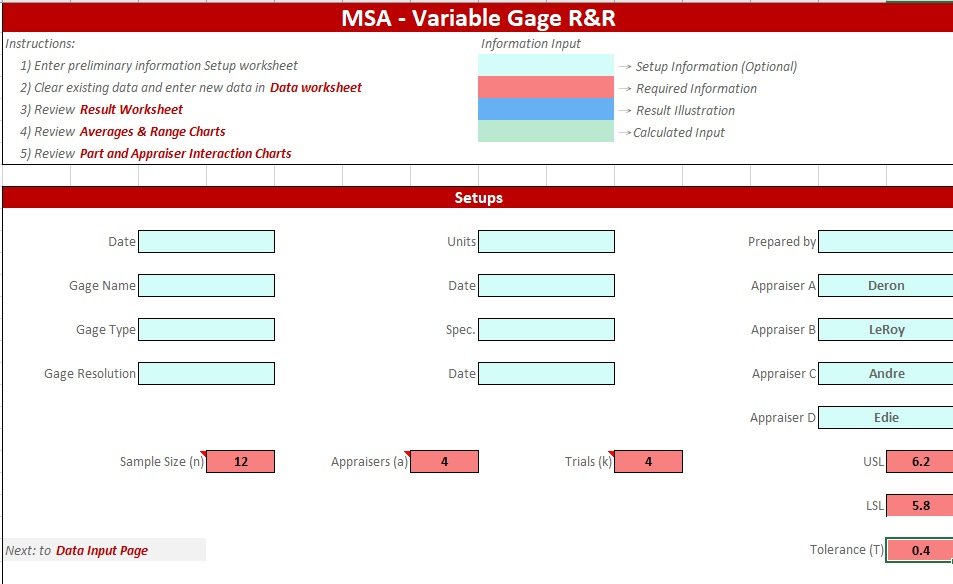
MSA Setup Page
For the setup, 4 aspects shall be stored since it will impact the coefficient selection.
- Sample Size per Subgroup (n)
- Number of Appraisers/Operators (a)
- Number of Trials per Sample (k)
- Specification (USL, LSL and Tolerance)
After the initial setup is completed for the numbers, then the data section should be implemented as the follwing format.

Gage R&R Data Format
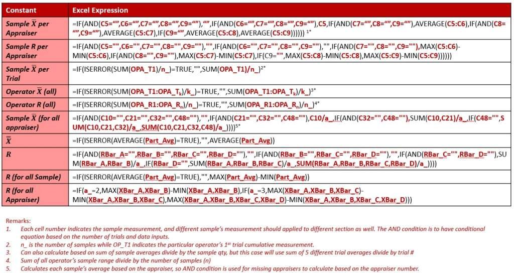
As seen in the data table, each appraiser will have maximum of 5 trials per sample and the following layout will have the following information.
- Individual Sample Average (Sum of sample measurement divide number of trials per sample)
- Individual Sample Range (Max of sample measurement subtract Min of sample measurement)
- Individual Trial Average (Sum of trial measurement for all samples divide number of samples)
- Average or Range of Individual Appraisers
The exact way to translate these calculation in Excel expression is listed below with caution remarks
Gage R&R Excel Expression
Once the data expression is completed, then the result section can be calculated and displayed below for setup.
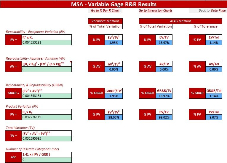
Gage R&R Result Layout
The Result’s Excel expression is listed in the following table for calculation reference.
Gage R&R Result Expression Setup
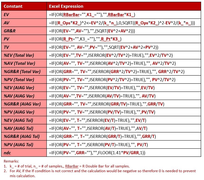
For the K1, K2 and K3 constant, a separate constant page is store and calculated below, and the representation of K1, K2 and K3 is referred below:
- K1 = Equipment Variation
- K2 = Appraiser Variation
- K3 = Part Variation
And the following table shows how to allocate the d2 constants and calculating appropriate setup for K1, K2 and K3.
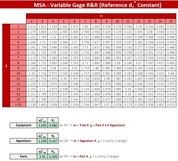
d2 Constant Setup Cell
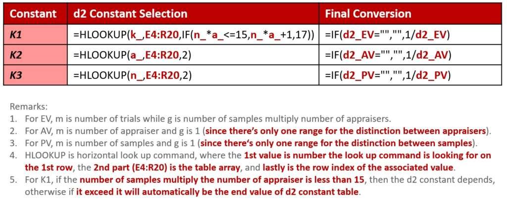
K1, K2 and K3 Calculation’s Excel Expression
Regarding the result description and criteria fit in, please check the commands below for the PV% and GRR% acceptance standard expression.
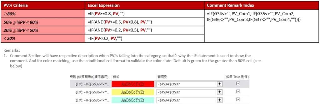
PV% Excel Criteria Calculation
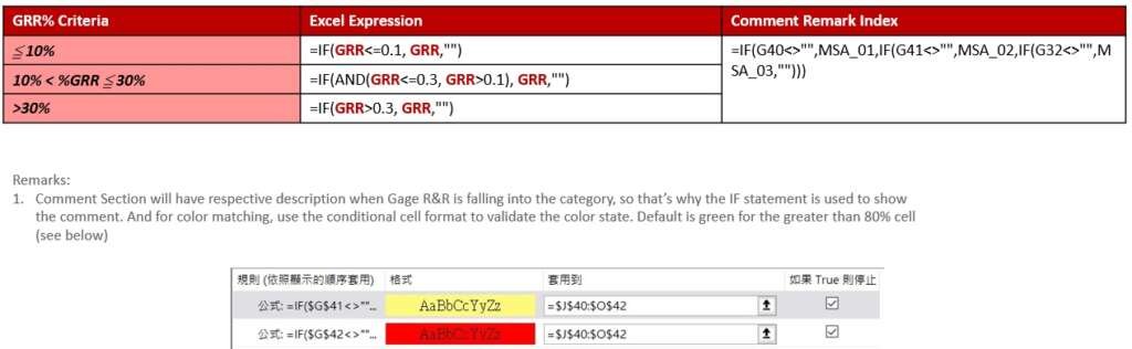
GRR% Excel Criteria Calculation
After the results are displayed, then it’s the graphing section to visualize the plots. And for the graphs, the charts can be observed by the following aspects.
- Variance Comparison Plotting
- X Bar Chart for the Measurement
- R Chart for the Measurement
- Sample Measurement Chart (by Sample)
- Sample Measurement Chart (by Operators)
- Part Interaction Chart
For the Variance Chart, please refer to the following Excel expression for plotting.
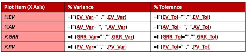
Plot Cell and Layout for the Variance Plot
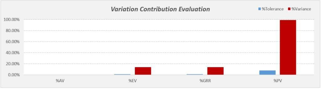
Variation Contribution Plot Example
For the X Bar and R charts, please refer to the following table expression for plotting, where the left hand side is for the sample numbers respectively while the top axis is for appraiser’s data along with X” and responsive control limits (see quantitative control chart link for the calculation reference).
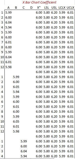
X Bar Chart Table Expression
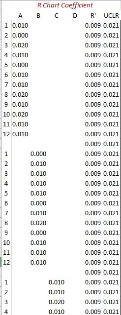
R Chart Table Expression
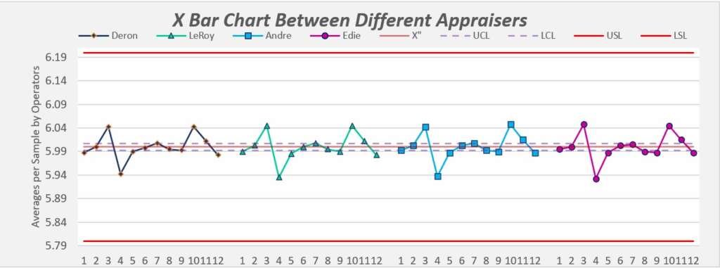
X Bar Chart for the measurements in each appraiser’s average per sample
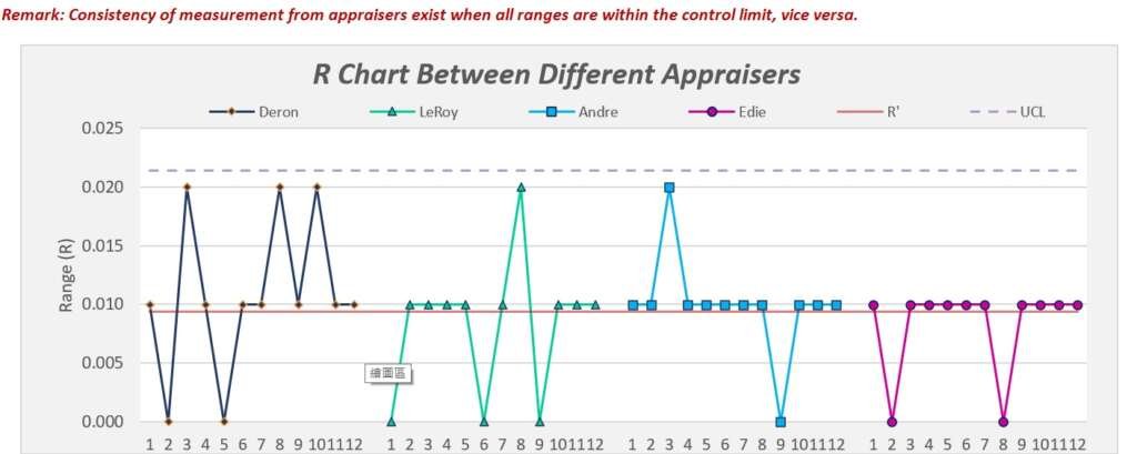
R Chart for the measurements in each appraiser’s average per sample
Lastly, the interaction chart between operators are plotting the operators or sample as x axis while plot each sample’s average with all the individual trial data to see the trend for each sample or operators. This is to see if there’s any clear variance between appraiser’s measurement method along with sample comparison.
And since there’s a lot of data needs to be duplicated into graphing the forms, so I use the OFFSET expression and return the value based on the horizontal (track column counts) for data setup.
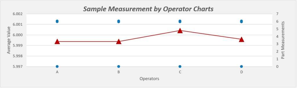
Sample Measurement per Appraiser Chart
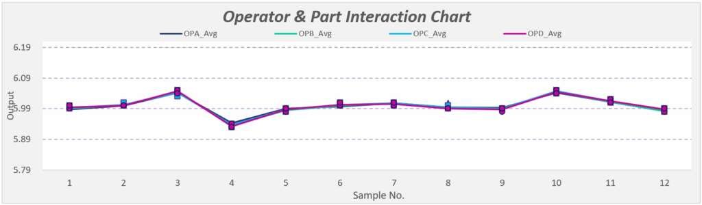
Appraiser and Sample Interaction Measurement